BANK OZK
Rebranding a Leading Commercial Lender
Role: Copywriting, Messaging, Tagline
Bank of the Ozarks was reintroducing itself as Bank OZK and needed a brand identity representing that evolution, yet still reflective of their community spirit. Think of it as: community bank makes good!
Honoring Heritage, Looking Forward
Messaging embraced the community bank roots, while still reflecting its promise to provide the best service, in person and online, regardless of geography — for current and future customers.
This is Not a Mockup.
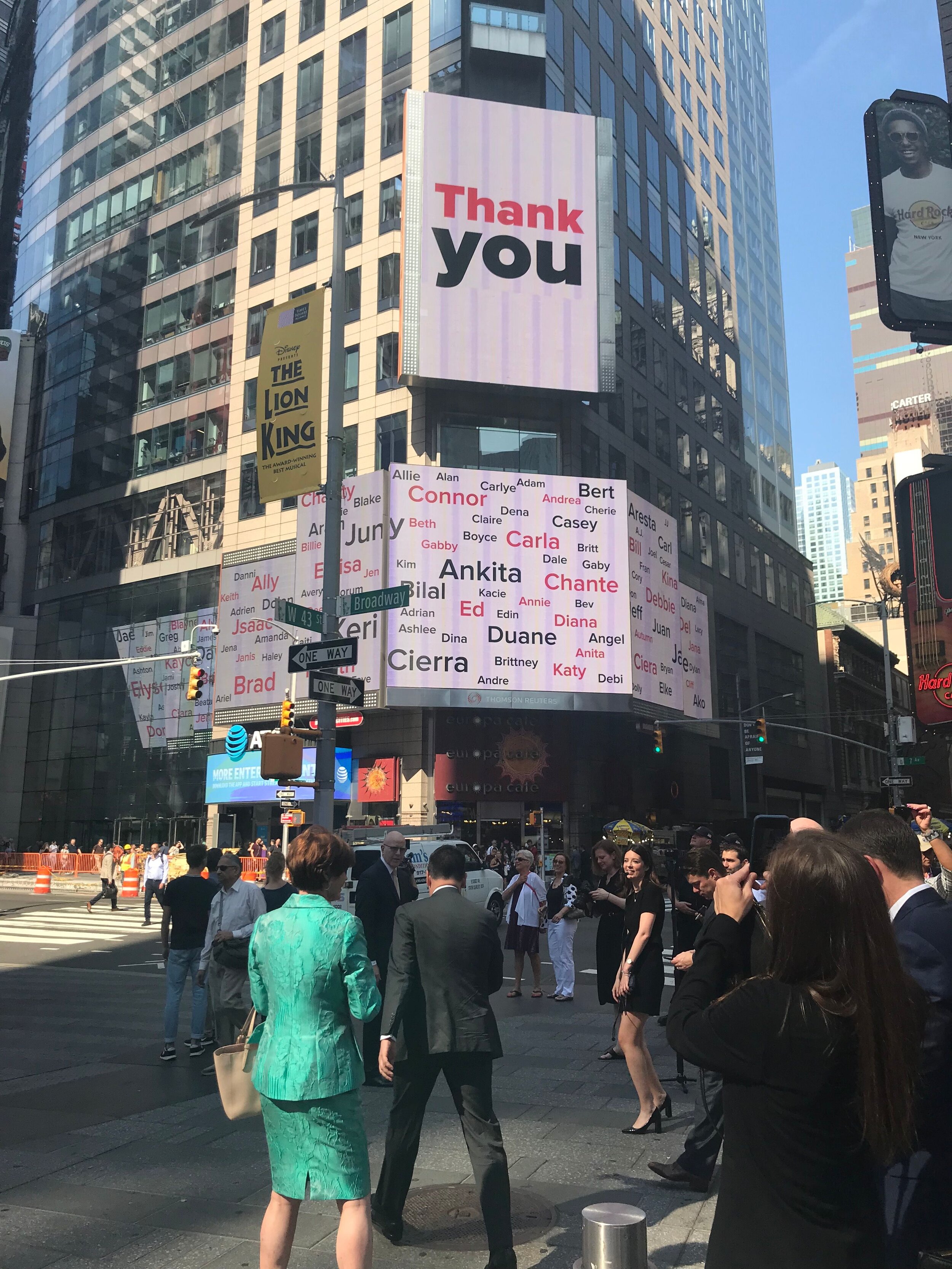
With a rebrand came a change in stock symbol and an opportunity to take over Nasdaq Tower.
The opening ceremony celebrated Bank OZK employees, naming every individual and showcasing the new messaging.

